
What it takes for "green means fine" to be true
In one line
The promise "green means fine" is true only if you can say what that green means. A threshold with no basis reassures everyone while saying nothing.
Why this was needed
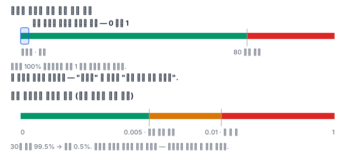
When you create a panel in Grafana, a threshold is already in it. The defaults written in the official documentation are these — the base is green, red from 80, and the mode is absolute. Where did this 80 come from? From nowhere. It is a convenience value set because many people use values between 0 and 100, like CPU utilization.
The problem is that the convenience value stays on our metrics as it is. An error ratio built with PromQL comes out between 0 and 1. If a red threshold of 80 is attached to that panel, even if the service fails 100% of requests, the value is 1 and does not cross the threshold. That panel is green forever. The screen said "it's fine" every day, and nobody had ever asked what that statement meant.
The opposite direction is common too. Someone says "red shows up too often" and quietly raises the threshold. With no basis, lowering it has no basis either. Once a threshold becomes a knob for feelings, from then on the screen trains the people.
How it works
A threshold lives not in the picture but in the dashboard model. Under fieldConfig.defaults.thresholds are the mode (mode) and the list of steps (steps), and each step has a color and a value. The value of the very first step is empty, which is the base the documentation talks about — minus infinity. Grafana sorts the steps by value and then picks the color of the last step whose value is at or below the current value. The boundary is inclusive. If a threshold is 0.005, then 0.005 is already that color and 0.00499 is the previous color.
Two rules follow from this. First, steps are written on the premise "lower is better" — as the value grows, it goes to worse colors. So for a metric where bigger is better, like remaining disk or success rate, you have to reverse the order. Put the base at red and make it green going up. If you do not reverse it, a completely empty disk shows as green. Second, there is no gap between steps. Every value always gets exactly one color.
There are two modes. Absolute compares the value itself against the threshold. Percentage compares what percent of the way the value sits between the minimum and the maximum. So a percentage threshold has no meaning without Min and Max from the standard options — which is why the documentation describes Min and Max as "the values used to calculate percentage thresholds." To color remaining disk by percentage, you must enter the total size of the volume as the maximum, and if you do not enter that number, Grafana guesses the maximum from the data currently on screen. Then the same panel gets a different color every time you change the time range.
The only explainable basis for choosing a threshold is what we promised users. If the 30-day availability target is 99.5%, the error budget is 0.5%, and while the error ratio exceeds 0.5%, you are burning the budget faster than the budget rate. So the threshold is computed: a warning at 0.005 and red at double that, 0.01. A threshold made this way can be defended in a meeting, and it changes along with the target when the target changes.
A screen that speaks in color alone creates another problem. For a person with color vision deficiency, red and green are indistinguishable, the same goes for retrospective materials printed in black and white, and some tools save alert captures in black and white. So color should be a supplementary signal, and the value and text should come first. In Grafana, you can attach text to each range using the Range rule of value mappings. For example, "normal" from 0 to 0.005, and "burning budget" above that. A mapping is scanned from the top and the first rule that matches wins, and both ends are included, so if boundary values overlap, the earlier rule takes it.
The last is the mismatch between the screen and the pager. If the panel's red is at 0.01 but the alert rule fires at 0.02, then during the time the error ratio is 0.015, the dashboard is bright red and nobody is paged. When an incident retrospective asks "why did nobody know," the answer is that the two numbers were written by hand in different files. The fix is to pull both from one place. If you write the number once in a target file and generate the panel and the rule from it, there is nowhere left for them to drift apart.
Let us also be clear about what this environment cannot judge — the color actually painted. The Grafana in this Pod has no image renderer plugin, so panels cannot be rendered as pictures. So the grader looks only at the threshold model and the query results. What color a value becomes can be verified by computing exactly the rule Grafana uses, but whether that red stands out on screen, or whether it is confused with the green of the neighboring panel, cannot be verified. A person has to look at that by opening port 3000 in the web preview.
What it looks like in the field
One team's payment dashboard had never once turned red in six months. That fact was often cited as grounds for trust. One day someone opened the panel JSON and found that the threshold was 80. The value of that panel was between 0 and 1. For six months, that green had meant not "it's fine" but "it says nothing."
On another team, the disk gauge was attached the wrong way around: instead of starting with red and ending with green, it did the reverse. Red when 90% of capacity remained, green when 5% did. The reason nobody said it was odd is that the panel was always green.
What you will do in the next lab
You start Grafana, create one panel with the default threshold as is, and calculate for yourself whether that threshold is a reachable value for our metric. Next, you pull the error budget from a target file, compute the thresholds and put them in, and check with Grafana's rule which color the current value is. You use absolute and percentage thresholds separately and see why the minimum and maximum are needed, and you make a value mapping say things in text as well as color. You build a small tool that checks the order and inclusion rule of thresholds with six boundary values, and fix the alert rule already in production and the panel threshold so that they pull from one value. Finally, you receive a production dashboard containing four threshold defects and submit it with all of them fixed.